Broken Clock Patisserie Cafe - the place where time stops. Inspired by the refined beauty of the artisan patisseries of mainland Europe, Broken Clock set out to bring a totally new flavour to Glasgow's cafe scene.
I worked with Anna and Artem to realise their vision of modernity and innovation with a logo and branding that had both the depth to be memorable and the simplicity to be cast in chocolate or printed on to a cake.
The Broken Clock logo takes visual reference from both traditional round clocks and cakes.
The hands open out to literally represent a broken clock. Revealed beneath are the broken segments of the clock. These can also be interpreted as the hidden layers. Symbolising one of Anna and Artem's core beliefs - that modern baking is all about what is concealed inside the outer shell of the cake.
“It’s what’s inside that matters.”


Anna and Artem were keen that the collateral assets for the brand took reference from their own product but kept a clean, simple aesthetic which allowed the assets to remain in date even as the menu continued to change and evolve.
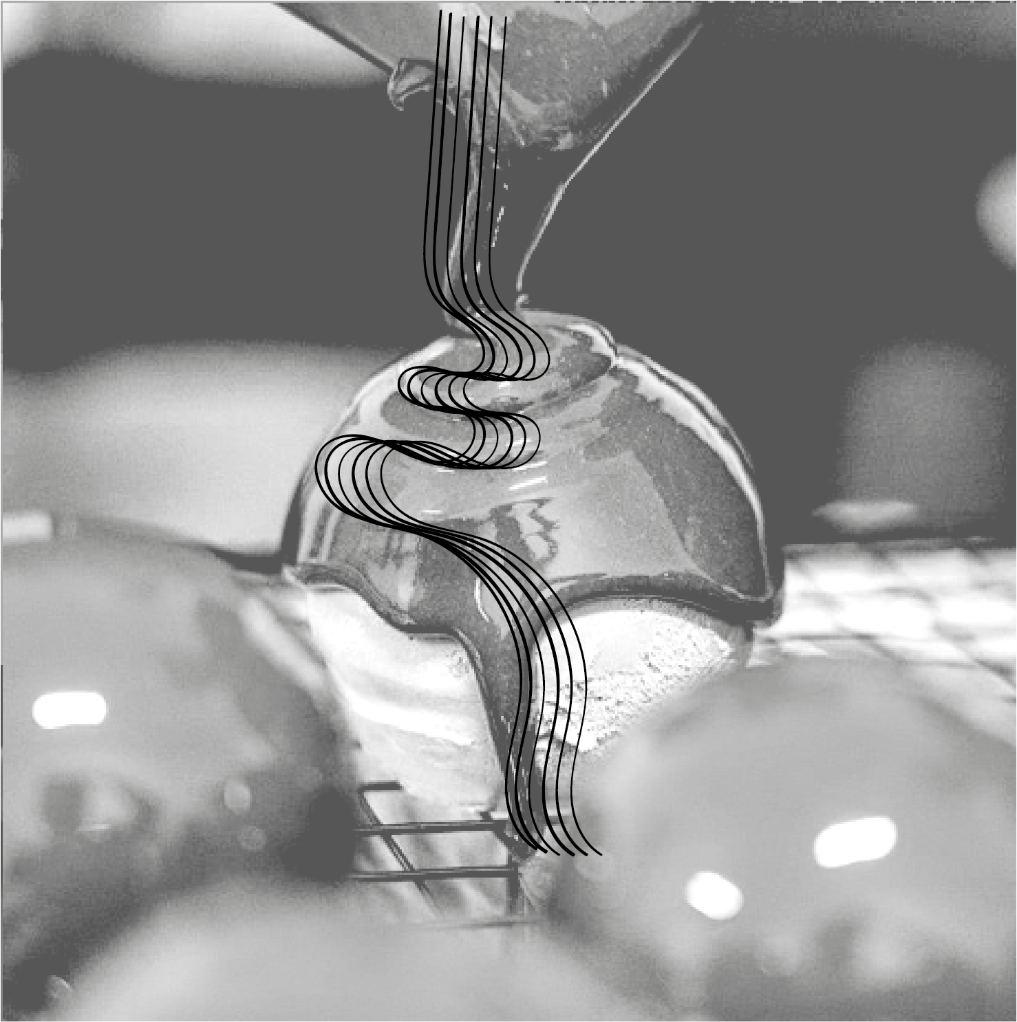
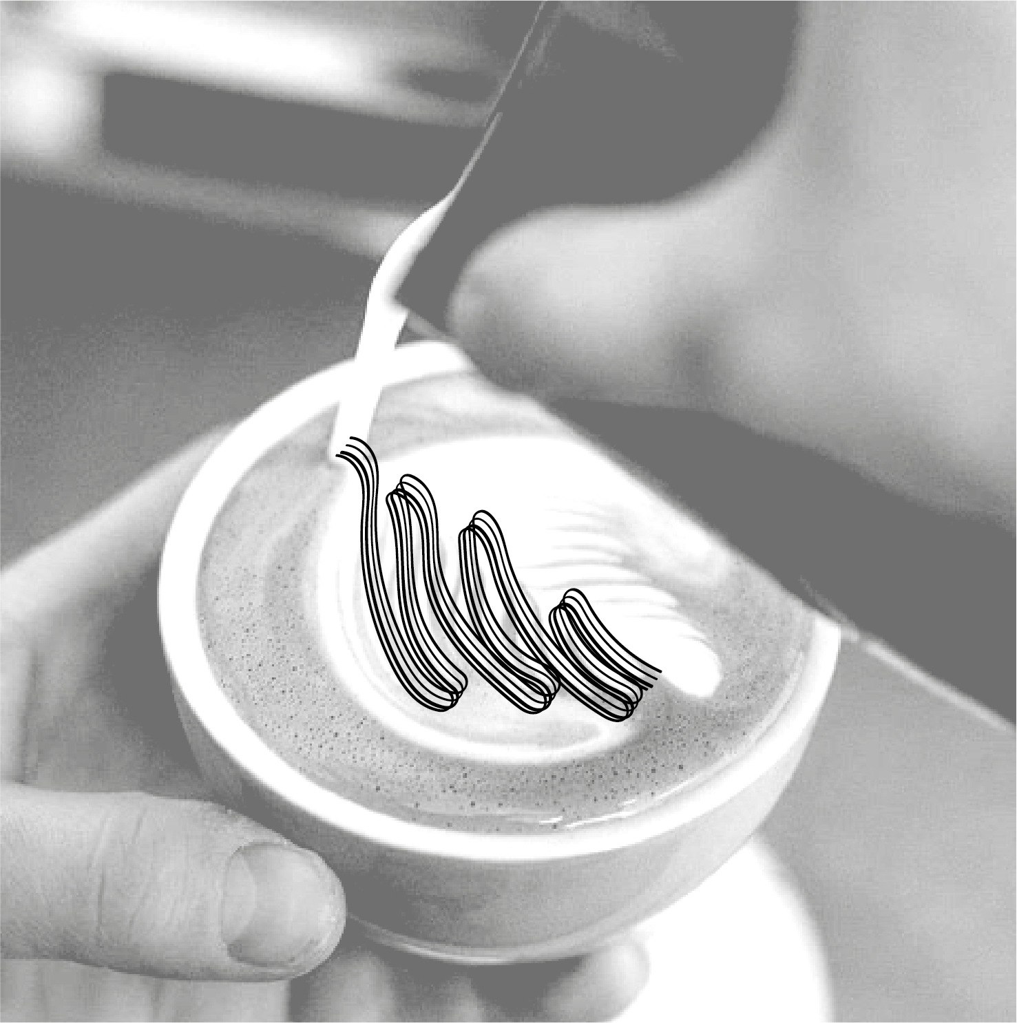
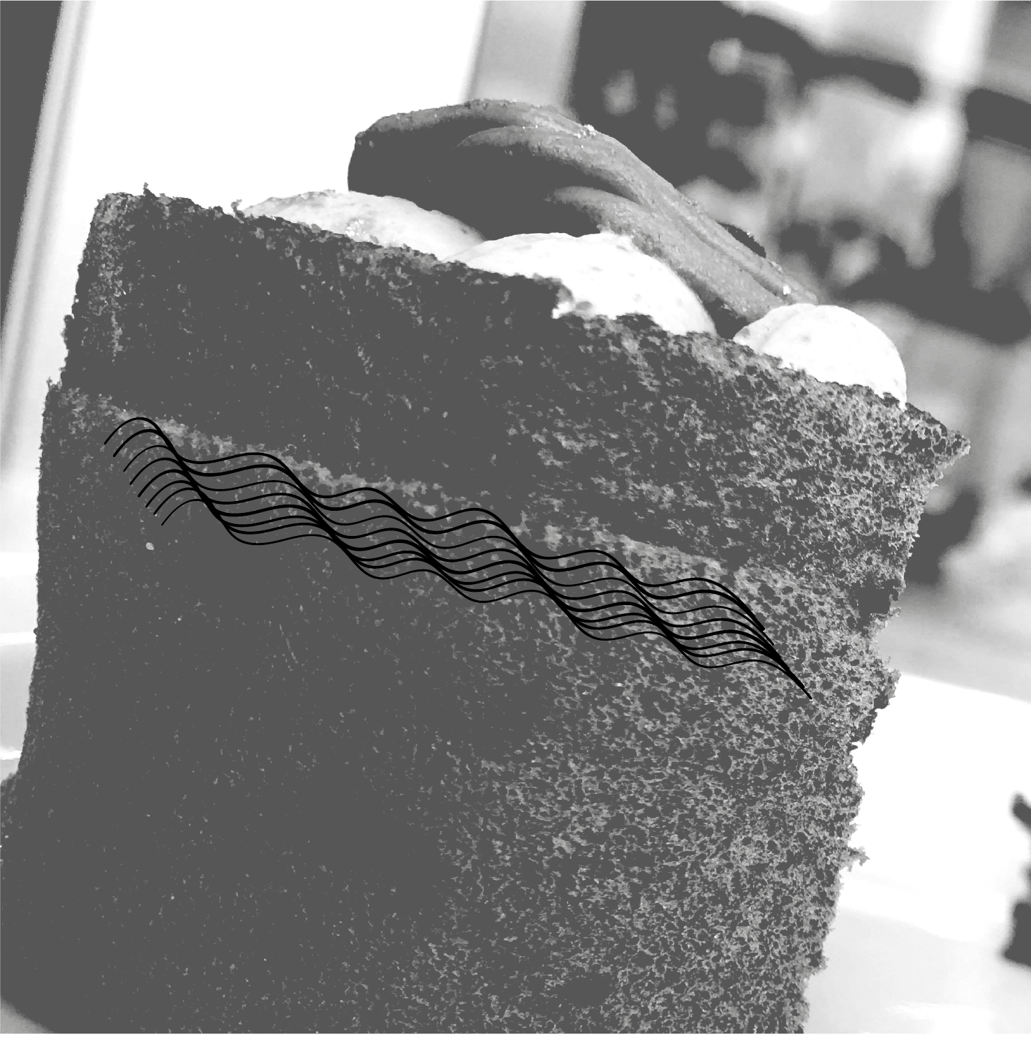
Using the dynamic shapes of their cakes and coffee, swirling motifs were created to adorn business cards, flyers and gift cards.